How to Make a Bar Chart Race Video on Your Phone
Bar chart races are weirdly addictive: bars racing past each other as the years tick by. They rack up millions of views — and you can build one on your phone. Here’s how.
The bar chart race is one of the most replayable formats on the internet — bars sprinting past each other as the years roll by. It looks like a data-studio job; in ExpoCut it’s a widget you feed your numbers to.
What makes a good chart race
You need ranked data that changes over time: a handful of categories, each tracked across several points in time. Great topics:
- Most populous countries by decade
- Top brands / companies by year
- Players or teams by points per season
- Subscribers, streams, or sales by month
Step 1 — Add the widget and load data
Add the Bar-Chart Race widget
It drops on the canvas as a layer.
Load your data series
Provide the categories and their values across each time step. The widget animates the bars growing, shrinking, and overtaking one another.
Set the pace
Tune how fast time advances so the race is exciting but readable.
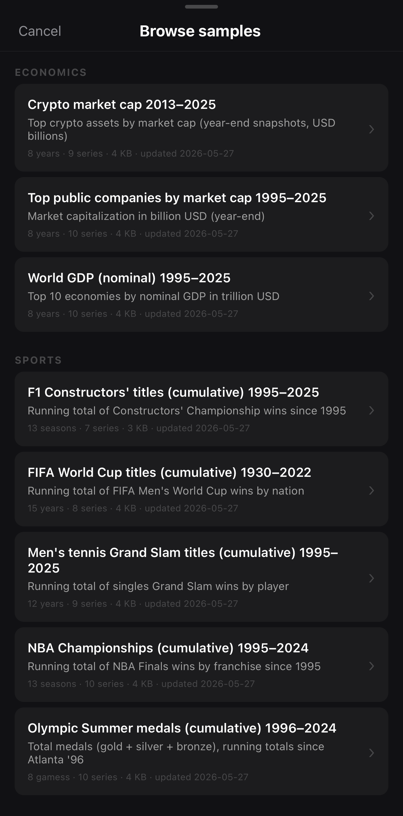 Start from a curated dataset — or load your own CSV
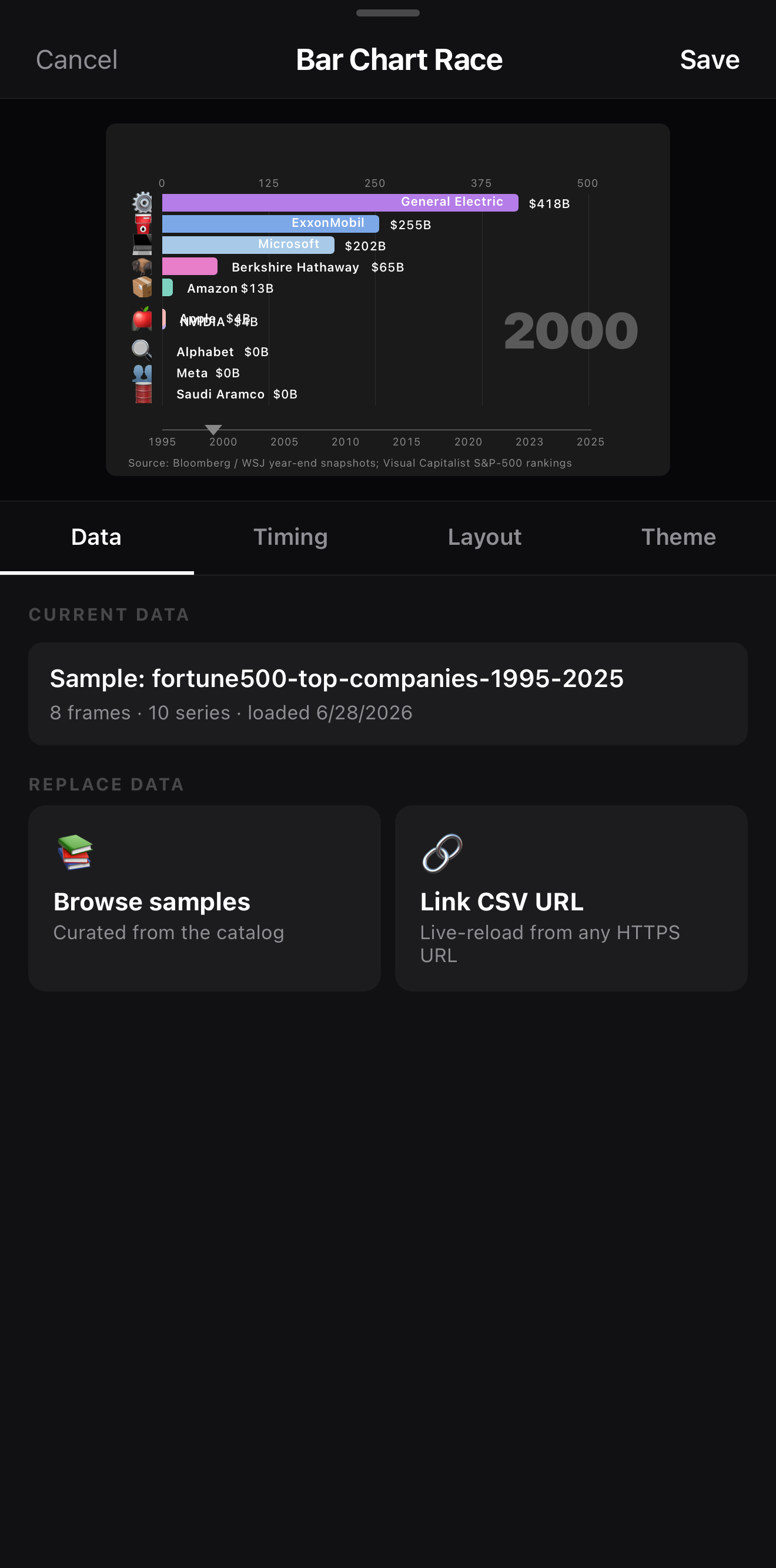 Bars grow, shrink and overtake as the year ticks up
5–10 bars is the sweet spot. Too few and there’s no race; too many and it’s a blur. Keep the field tight so the lead changes are easy to follow.
Step 2 — Style it
Give each category a consistent color, keep labels legible, and add a clear time indicator (the year/month ticking up is half the appeal). Match the palette to your brand or theme.
Step 3 — Wrap it in a video
A bare chart is data; a video is data plus storytelling:
- A title up top: “Most-Subscribed Channels, 2010–2025.”
- A building music track — the motion loves a beat.
- A payoff at the end: freeze on the final ranking with a quick callout.
Where to go next
- More overlays: scoreboard, poll & data widgets.
- Title and label it: text & titles.
- Score it to music: add music & audio.
Pick a ranking that changes over time, feed it in, style the bars, and add a beat — that’s a chart race built entirely on your phone.
Frequently asked questions
How do I make a bar chart race video?
Add the Bar-Chart Race widget, load your data series (categories and their values over time), and ExpoCut animates the bars growing and overtaking each other. Style the colors, labels, and speed, then export like any other video.
What kind of data works for a chart race?
Anything ranked that changes over time — most populous countries by decade, top brands by year, players by points per season, channel subscribers by month. You need a few categories tracked across multiple time points.
Can I add music and a title?
Yes — a chart race is just a layer, so add a title, a background, and a building music track. The motion of the bars pairs perfectly with rhythmic music.
Race your data
Animated bar chart races — bars overtaking each other as time ticks by — built on your phone. Load the data, style it, export the views.
Get ExpoCut Browse all guides